In today’s digital world, mobile is everything. More than 70% of website traffic now comes from smartphones, making it critical for businesses to offer a mobile-friendly website design that’s fast, easy to navigate, and visually appealing across all screen sizes (Mobile-Friendly Website Design Services).
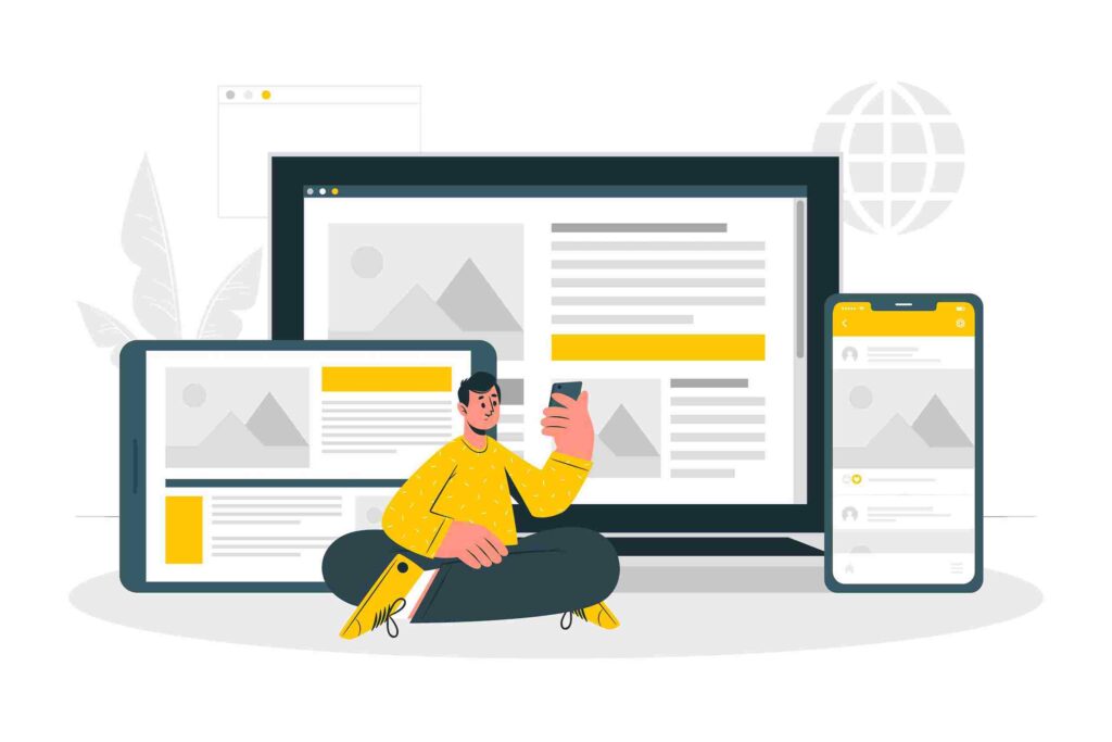
At Sauni.tech, we specialize in building modern, responsive websites that deliver exceptional performance on mobile, tablet, and desktop. Whether you’re a startup, local business, or eCommerce brand, we’ll make sure your website looks and works perfectly on every device.
Why Mobile-Friendly Website Design Matters
A mobile-friendly website isn’t just about adjusting layouts—it’s about delivering the best possible experience to your users.
Here’s why it’s essential:
✅ Google Ranks Mobile-First
Google now indexes websites based on their mobile version first. If your site isn’t mobile-optimized, your rankings will suffer.
✅ Better User Experience
Users expect fast, smooth mobile navigation. A mobile-optimized site improves:
- Readability
- Navigation
- Tap targets and buttons
- Engagement and conversions
✅ Reduced Bounce Rate
If your website doesn’t load properly or quickly on mobile, users will leave—often within seconds.
✅ Increased Conversions
Mobile visitors are more likely to take action when your website is clear, fast, and easy to use.
What is a Mobile-Friendly Website?
A mobile-friendly website is designed to adapt to various screen sizes and devices—phones, tablets, laptops—without breaking layout or performance.
It includes:
- ✅ Responsive design layout
- ✅ Scalable images and font sizes
- ✅ Clickable buttons with proper spacing
- ✅ Touch-optimized navigation
- ✅ Fast page load times
At Sauni.tech, we build websites using modern frameworks like WordPress and clean HTML/CSS to ensure top-notch mobile usability and speed.
Mobile-Friendly Website Design Services by Sauni.tech
We offer end-to-end mobile-responsive website solutions tailored to your brand, audience, and goals.
Here’s what’s included:
1. Custom Responsive Design
We don’t rely on templates. Every site is:
- Designed from scratch for mobile-first performance
- Tested on multiple devices
- Built to showcase your brand identity and messaging clearly
2. Speed Optimization
Mobile users expect websites to load in under 3 seconds. We deliver that by:
- Compressing images
- Minimizing scripts and code
- Using caching and CDN integration
- Lazy loading for images and videos
3. SEO-Optimized Structure
A mobile-friendly website must also be SEO-friendly. We include:
- Clean code and semantic HTML
- Keyword-targeted headings
- Mobile meta tags
- Optimized title and meta descriptions
- Google Search Console integration
Want more ongoing SEO support? Explore our Affordable Website Design Packages with SEO add-ons.
4. Mobile-First Navigation
We create simplified mobile menus, collapsible sections, and sticky CTAs to help users navigate and act fast on mobile.
- Hamburger menu setup
- Tap-friendly links and buttons
- Easy-to-scroll layouts
- One-click WhatsApp/chat buttons
5. Analytics & Mobile Reports
We integrate:
- Google Analytics 4
- Google Search Console
- Mobile performance tracking
- Device-level user behavior insights
This helps you track how mobile users are interacting with your website.
Who Needs a Mobile-Friendly Website?
If your current website is hard to use on mobile or loads slowly, it’s time for a redesign. Our services are perfect for:
- Small businesses
- Startups
- eCommerce stores
- Salons, gyms, and clinics
- Freelancers and personal brands
- Restaurants and cafés
Benefits of Mobile-Optimized Design
| Benefit | Impact |
|---|---|
| Improved SEO | Higher Google rankings |
| Better UX | Increased time spent on site |
| Higher Conversion Rates | More inquiries, leads, and sales |
| Brand Credibility | Modern, professional impression on users |
| Broader Audience Reach | Smooth experience across all devices |
Pricing for Mobile-Friendly Website Design
We offer budget-friendly packages tailored to business needs:
| Package | Price (INR) | Features |
|---|---|---|
| Starter Plan | ₹25,999 | 3 pages, mobile-responsive, contact form, basic SEO |
| Standard Plan | ₹74,999 | 5 pages, responsive design, blog setup, speed optimization |
| Premium Plan | ₹99,999+ | 7-10 pages, WhatsApp/chat integration, mobile CTAs, SEO setup |
👉 For long-term results, consider adding monthly SEO services.
Internal Links to Explore
- Professional Web Designers Near Me
- Website Design Company in Gurgaon
- Custom WordPress Website Design Services
📸 Explore our responsive website designs on Instagram: @sauni.tech
Our Process
Step 1: Planning & Mobile UX Strategy
We identify your goals and plan how users will interact on phones and tablets.
Step 2: Mobile-First Design & Development
We design layouts for mobile first, then adapt to larger screens.
Step 3: Testing Across Devices
We test on Android, iOS, tablets, and different screen sizes.
Step 4: Launch & Post-Support
Your website goes live, fully optimized, and ready to grow.
Final Thoughts – (Mobile-Friendly Website Design Services)
If your website doesn’t work well on mobile, you’re losing customers. Our mobile-friendly website design services help your business stay ahead, drive traffic, and convert visitors—no matter what device they’re using.
📞 Let’s get started today! Book your free consultation at Sauni.tech and we’ll design your website for the mobile-first world.